
Cloverleaf Farms, nestled in the heart of Davis, California, represents the epitome of sustainable, regenerative agriculture. Dedicated to crafting exquisite organic fruit products, every item emanates a labor of love and meticulous care. Entrusted with the revitalization of their packaging, my mission was to encapsulate the essence of their artisanal creations through color and whimsical fruit illustrations.
Redesign
Packaging
Illustration
Cloverleaf Farms

Original Label
Before redesigning the label, Cloverleaf had utilized the same design since their conception in 2011. The client wanted the label to, “look more modern”. I accomplished this by updating their logo using a sans-serif typeface and minimalistic illustration.
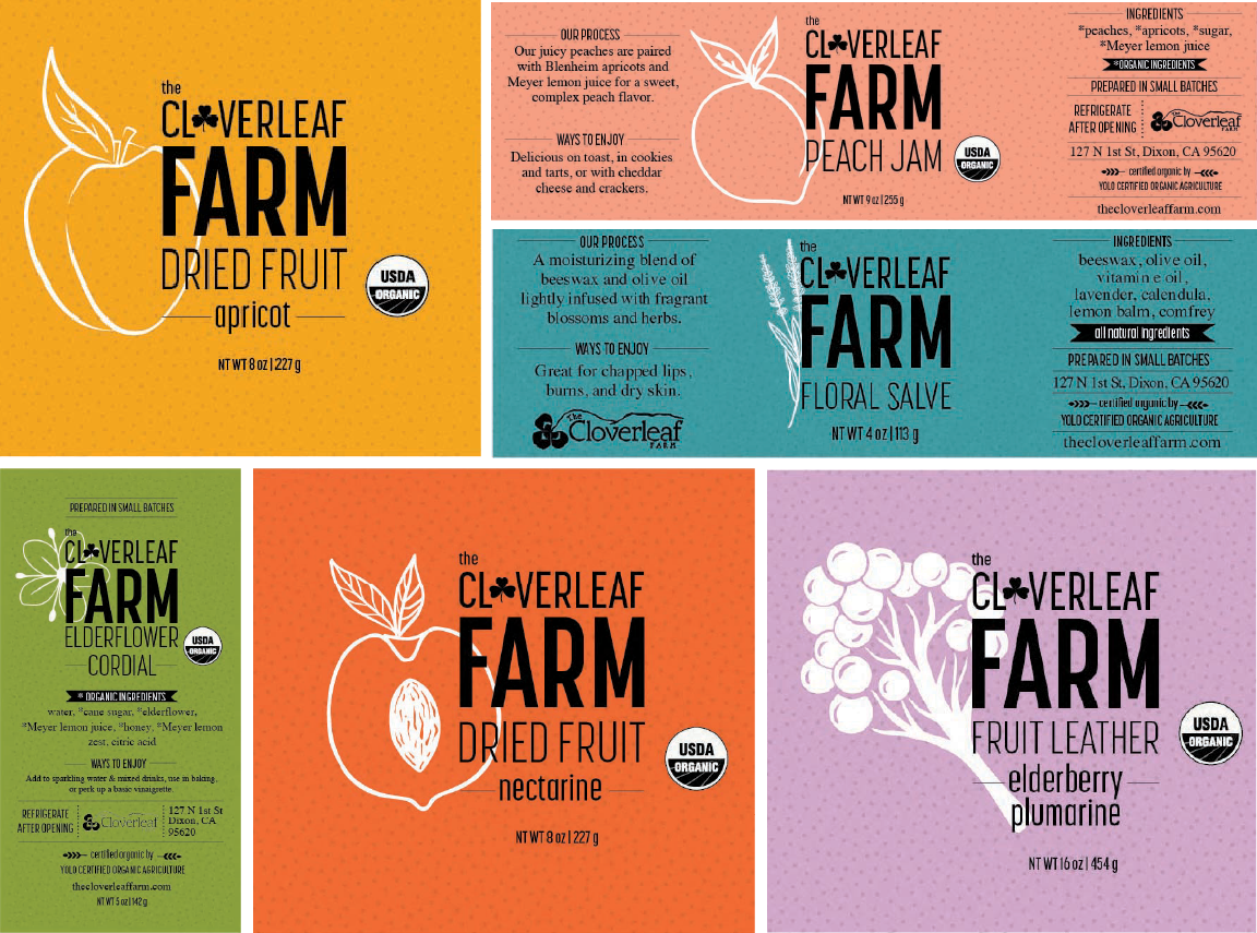
Redesigned Labels
In total I created 21 different labels for the various fruit products with 8 different distinct fruit illustrations all drawn in the same style in order to create cohesive branding across all of the items. I also utilized different colors to express the different fruit types
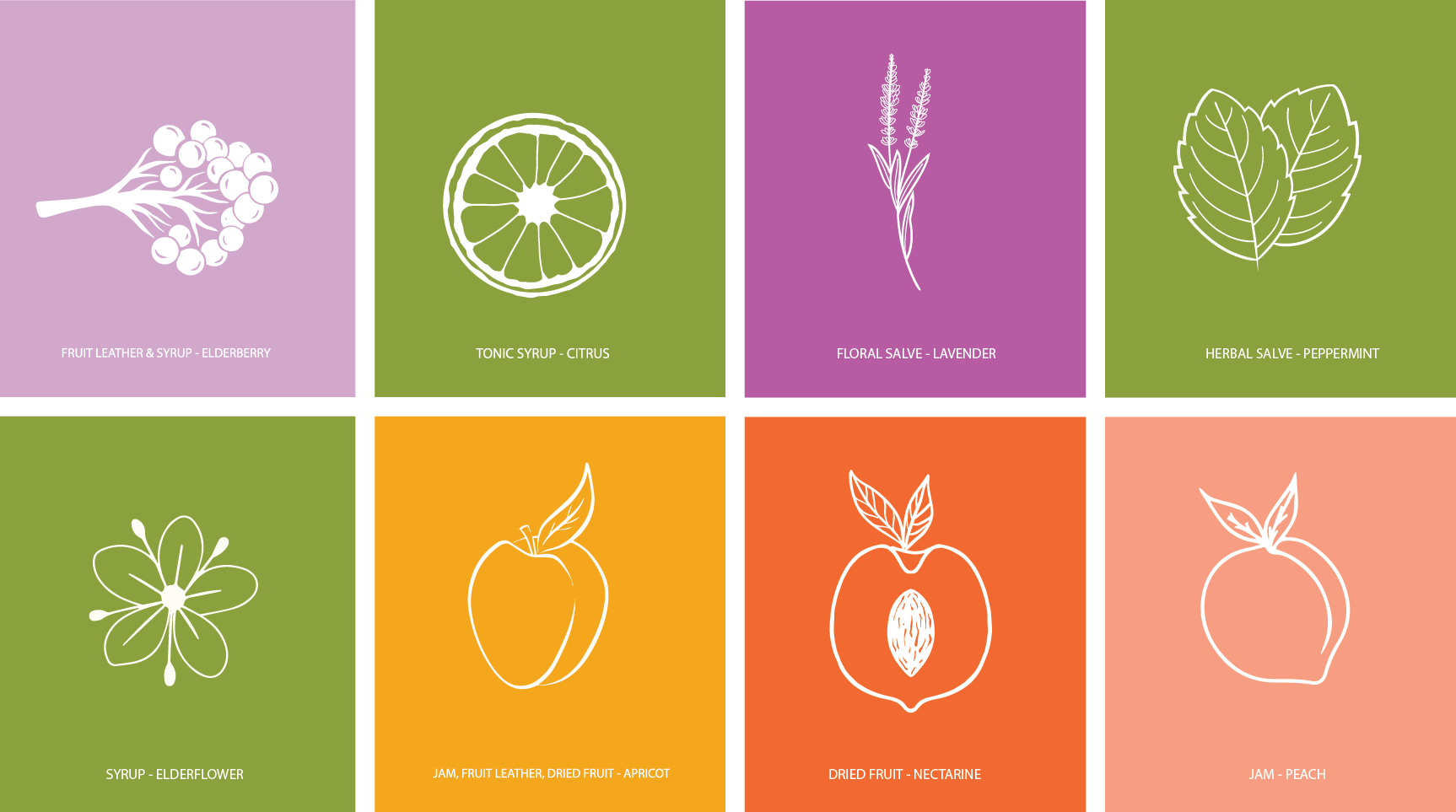
Fruit Illustrations to be used across various products
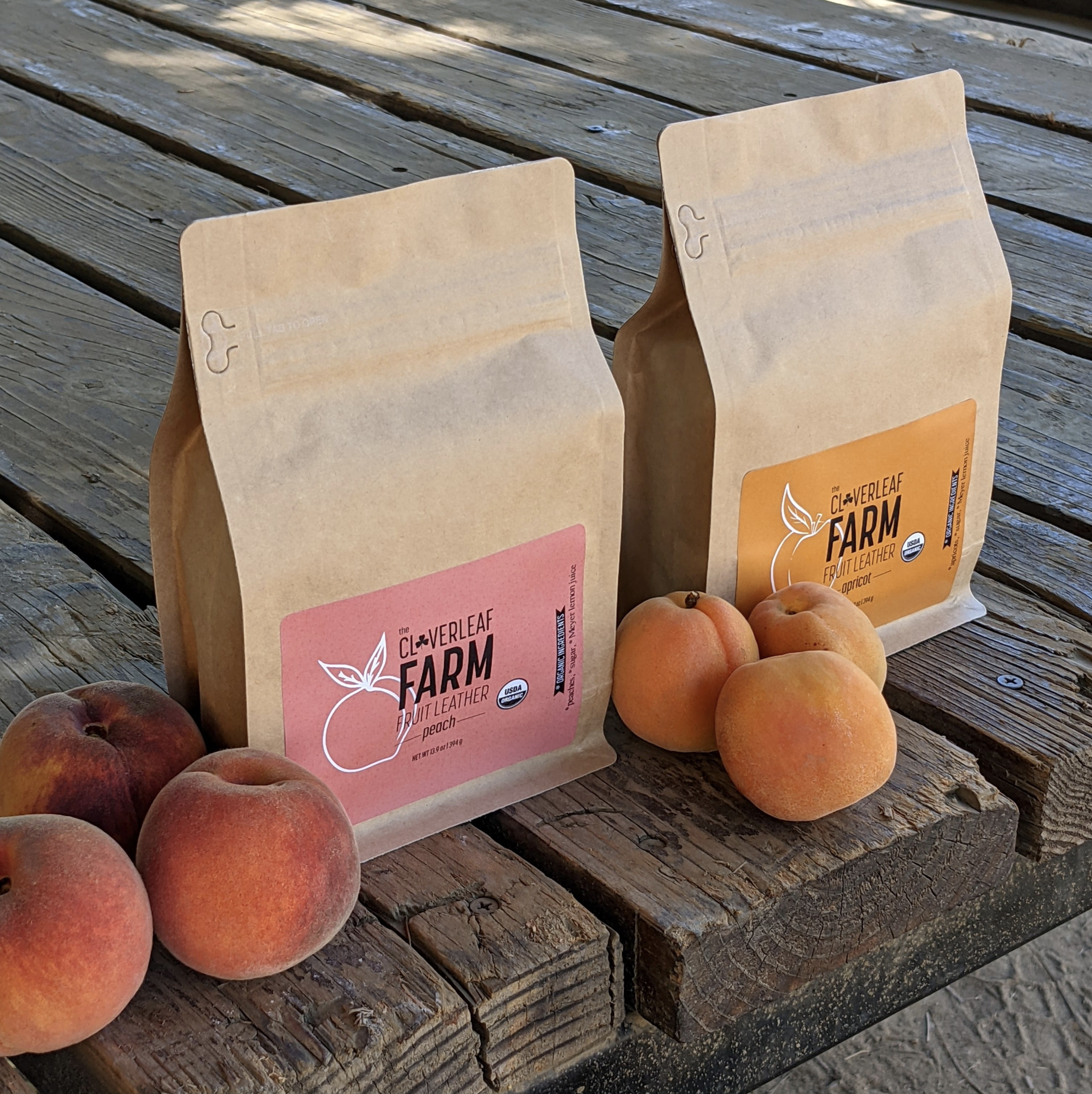
Printed Labels